
To provide our clients a self-serving tool to download the reports they need for their day-to-day work.
Only the On-demand report has a preview feature. The other two don’t.

Small preview window brings lots of inconvenience to users.
Three types of reports use different processes. In On-demand report, users have to select report first, while Document Fulfillment report and Monthly report, however, can select before or after the time configuration. And On-demand report provides a preview feature, while others don’t.
Select Month (time) and Report → Select Format (Excel or PDF) → Generate and download

For Monthly report, report selection can be before or after the time configuration.
Select Report → Select Plan or Date Range (depends on reports) → Generate → View data or download (CSV, Excel, PDF)

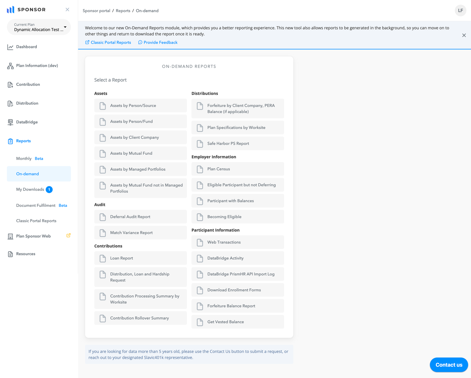
Selecting report is the first step of the On-demand report process.
Select Plan and Report → Generate and download

Selecting a report on Document Fulfillment report can be before or after plan selection.
Generating reports is an essential function, but it can also be a significant challenge, especially when reports take more than 3 minutes to generate. In such cases, users are left with only three options: they can either wait for the report to generate, quit the process, or complain to us. This issue is particularly common for our major clients who manage multiple companies and participants under a single plan, leading to large volumes of data to load.

Loading time varies widely. Some may take more than 3 minutes without any progress indicator.
The View feature in On-demand reports is a great idea, but the small preview window is difficult to view, especially for a long list.
A small preview window brings lots of inconvenience to users.
On-demand reports have more than 20 reports. The dropdown menu makes it difficult for users to quickly locate the reports they need.

On-demand report has a very long report list.
Our major clients (PEOs) may have more than 1000 plans, and the dropdown doesn’t support quick searches.

Long list of Employers for some of our major clients.
Report → time / Plan → Download
Time / Plan → Report → Download
Decided to go for report first (option 1) because

Monthly report uses the select-report-first method.

On-demand report uses the select-report-first method as well.
For Docful reports, however, I decided to use option 2 (selecting plan before report) because

Docful reports use the select-report-later method.
Worse solution because
Better solution because
Worse solution because
Better solution because

My Downloads can help users avoid unexpected long waiting.
Design the View page for Monthly and On-demand reports only, not Docful because
Provide clear documentation on filter configuration, sorting, searchable columns etc.

View page is available for users to preview online.
Group reports by the types of purpose and functions
Grouping reports by functions helps users easily locate their target.
Provide search functions

Users can use the search function to find the plan quickly.
Originally, users could only select one plan at a time. However, based on users’ feedback, they need multiple selections to more efficiently complete their tasks. Therefore, we added the functionality to support their needs. Chips on the top represent the selected plans, and we limit the maximum 5 plans at a time due to the system workload concern.

Multi-select was added per users’ request.
“Beta” is used to convey the idea of this new but can-be-improved version. At the same time, we keep the classic report until we fully implement all three functions and users are used to the new design.

Users can take their time to transition to the new features with "Beta" and "Classic Portal Reports.”
Because of the business requirement, we only allow users to download the CSV in version one. However, some users strongly recommend XLS and PDF formats because some reports have errors in some columns on CSV. This also affects the design of My Downloads in that we provide an additional column of file type to help users better distinguish the differences between reports.

Used to only have “Generate .csv” button but it’s been changed into a modal providing three formats.
This information is on the report but no showing on the View page. However, some clients need it to be seen, so we add on it.

Total numbers are added at the bottom of the View page.
Due to too many filters and export buttons on the header, I discussed with the Front-end team how to display them when the screen size is getting smaller. This is how we do it: Shrink the search bar, combine the filters, and then make the search bar into an icon. Break points are also adjusted, particularly for this product.

Resolution ≥ 1440px

Resolution 1200-1439px

Resolution 1024-1199px

Resolution 768-1023px

Resolution ≤ 767px
In our company, we don't have enough resources to do in-depth research with our users, so the user feedback after launching is super important to help designers learn some nuances of using habits. I learned many exciting user needs that I didn't take care of in our MVP.
This was my first time using the idea of soft release and allowing both new and old designs to be available simultaneously. It is a useful method to give users enough time to get used to the new version; meanwhile, we buy time to improve the product.